Analysis of highlights of works
**Recommendation for Midjourney Prompt Creation: SaaS Dashboard UI**
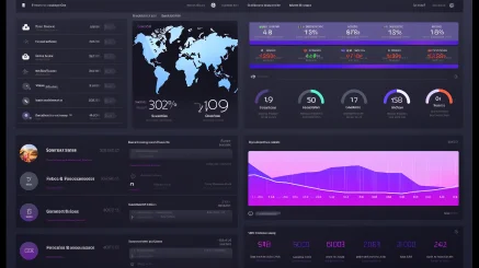
When crafting a visually compelling image for a SaaS dashboard using your specified prompt, it’s crucial to delve into the nuances of color, layout, and overall design to create a dynamic yet professional aesthetic. Here’s a detailed recommendation to enhance the artistic and creative aspects of your Midjourney prompt:
### Suggested Prompt
**Midjourney Prompt:**
“/image SaaS dashboard, UI, purple, black, white background, frontal view, modern design, sleek typography, interactive elements –ar 16:9 –style raw –v 5.2”
### Breakdown of the Elements:
1. **Color Scheme**:
– **Purple**: As the primary color, purple is known for its association with creativity, innovation, and luxury. It can evoke feelings of trust and sophistication—ideal qualities for a software product. Consider varying the shades of purple to represent different UI components. Deep royal purples can outline features, while lighter shades can be used for backgrounds and hover effects.
– **Black and White Background**: The classic black and white combination provides a stark contrast that enhances readability and usability, while also allowing the purple accents to pop. This minimalist approach aligns with contemporary design trends where less is more, simplifying the user interface.
2. **Layout & Composition**:
– **Frontal View**: Presenting the dashboard in a frontal view allows users to easily visualize the functionality and overall aesthetics. It is beneficial to organize UI elements in a grid-like format, ensuring a clear hierarchy. This can involve arranging navigation bars, statistics panels, and interactive graphs in such a way that the viewer’s eye moves smoothly from one section to the next.
– **Aspect Ratio (16:9)**: Utilizing a widescreen aspect ratio is beneficial for creating a modern feel. This ratio is common in video production and allows for a full view of widgets and dashboards, which can be particularly useful for showcasing detailed analytics or multiple sections simultaneously.
3. **Artistic Style**:
– **Raw Style**: The raw style allows for an organic, unfettered representation of the UI elements. Emphasizing natural textures and forms can resonate well in a tech environment that seeks to present usability without the clutter. This approach can include the imprecision in the edges of elements or subtle details that hint at a hand-drawn feel, inviting users to appreciate the design process.
– **Typography**: Select sleek, modern fonts that are legible and align with the tech-savvy nature of a SaaS platform. Pair bold headers with lighter body text to create a visually appealing contrast that guides the viewer’s focus.
4. **Interactive Elements**:
– Consider incorporating visual hints of interactivity such as buttons or sliders that pop off the screen slightly. Shadows and gradients can add depth and dimension, further providing a sense of realism to the dashboard.
5. **Additional Features**:
– Integrate small embellishments like notifications or icons in purple accents that indicate real-time user engagement. This not only enriches the visual but emphasizes the functionality of the dashboard.
6. **User-Centric Approach**:
– In designing the dashboard, envision various user personas who might interact with your SaaS product. Tailoring elements that cater to different user needs can transform a simple UI into a compelling narrative that not only displays data but engages the user on a cognitive level.
### Conclusion
In summary, the outlined prompt will guide you in creating a visually striking and artistically enriching SaaS dashboard using Midjourney. By focusing on these color schemes, layout compositions, typography, and interactive elements, you will facilitate a unique user experience that embodies the essence of modern software design. The goal is to merge functionality and visual appeal seamlessly, transforming routine data interaction into an engaging and sophisticated visual journey. Happy creating!
Midjourney prompt Share
/image SaaS dashboard, UI, purplr, black, white background, frontal –ar 16:9 –style raw –v 5.2
Prompt generation effect





暂无评论内容